Data Art & Science
From information visualization to data painting — where numbers become images and science becomes art.
The Data Artist
ALAgrApHY holds a PhD in Complex Systems and expertise in Data Science and Artificial Intelligence. His scientific background informs every artistic decision — and his artistic sensibility transforms every dataset into a visual experience.
Data Art occupies the space between the scientific image and the aesthetic object. Where traditional data visualization serves to communicate information, Data Painting uses data as raw material for emotional and aesthetic expression — the data is not explained, it is felt.
His data art has been presented at UNESCO, ISCB (winning the Art & Science competition), scientific conferences and international art exhibitions. He is a Postdoc alumnus of the Université Pierre et Marie Curie / CNRS and has been Artist and Scientist in Residence at the Instituto Gulbenkian de Ciência.
Scientific Image Awards
Winner of the ISCB Art in Science competition and the Biomed Scientific Image award — recognition that data visualisation and art are not separate disciplines.
Information Visualization
Complex datasets — social networks, biological systems, climate data — rendered as navigable, aesthetic visual systems that reveal hidden patterns.
Data Painting
Raw numerical data translated into visual language — not to explain, but to express. Each data painting is unique, generated from a specific dataset that carries its own meaning.
Personalised Data Art
Commission a data artwork generated from your own personal, corporate or public data. Transform your digital footprint into a unique aesthetic object.
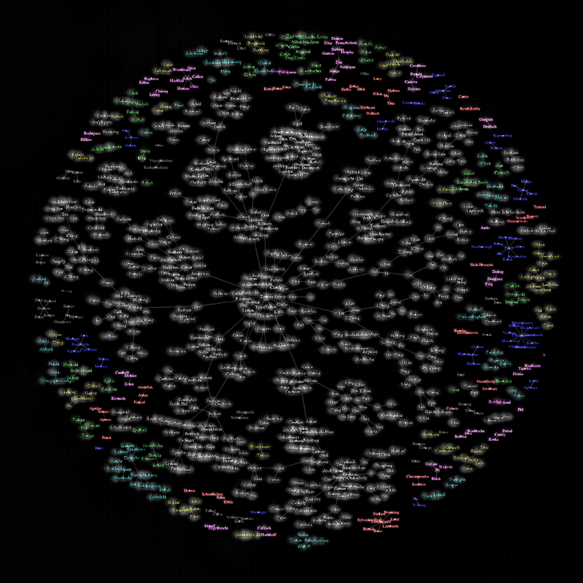
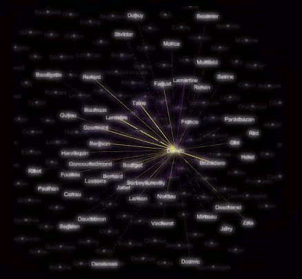
Prestige Network Analysis and Visualization
A visualization of the Artificial Immune Systems co-authorship network with nodes representing authors and edges representing collaborations (with at least one co-authored article). Each component is represented in a different color. In particular, the largest component (in black) contains 55% of all authors. The authors are then ranked based on a prestige measure that is discussed in the article:
Would you like to have your company's network analysed and visualised and then turned into an artwork?
Interactive Stream Data Analysis and Visualization
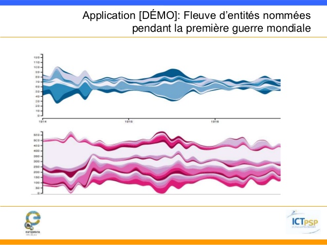
...we use unsupervised named entity recognition and streamgraphs in order to visualize massive amounts of unstructured textual stream data, namely, French newspapers (e.g. Le Figaro, La presse, L'humanité) from the first world war period. Such a visualization allows us to identify main characters, events and locations involved in or relevant to the first world war, according to the French press.
Would you like to have your own stream data analsed and visualized also produce an interactive timeline visualization?
Image Data Visualization and Analysis
One of the projects that are on high-demand in companies and institutions are finding the average face employee, researcher or client. Many more projects are performed live and on demand. Please contact me for more information.
More of the image visualization can be found under my digital art with Generative Art, Algorithmic Art and especially Fracatal Art or using Artificial Intelligence or AI-generated art.
Would you like to have your company, university, community analysed and visualized?
AI-generated Music - Audio Visualization and Analysis
Computer and AI-generated Audio and/or music opens a whole new possibility to engage with your employees, residents, students, clients... Here is a tiny example of what we can do:
Would you like to have your company, university, community's voice remixed or enhanced?
Your Data, Painted
ALAgrApHY creates personalised data artworks from private or public datasets — social media data, financial data, biological sequences, network maps, or any data that tells your story.